Shadcn Theme Generator Documentation
Complete guide to customizing shadcn/ui themes with advanced Pro features and AI-powered generation.
Overview
The Theme Generator lets you customize every aspect of your shadcn/ui theme in real time - colors, typography, radius, shadows, and more. Changes are applied instantly and previewed live across Components, and Block preview pages.
Learn the fundamentals of shadcn/ui theming concepts, CSS variables, and color systems in the official shadcn/ui theming documentation before diving into our advanced Theme Generator features.
Getting Started
You can use the Theme Generator in two ways - pick the one that matches your situation:
Starting a new project?
Design your theme using the Theme Generator, then open the Copy dialog and select New Project. Use the shadcn init command to initialize your project with the correct style, base (Radix or Base UI), icon library, and menu settings all in one step.
Already have an existing project?
Open the Theme Generator, customize your theme, then open the Copy dialog and select Existing Project. Use the shadcn apply command to apply your theme on top of your current project without reinitializing it.
To start customizing your theme:
- Click the rainbow palette button in the top header to open the Theme Generator panel
- Use the manual controls to adjust colors, typography, style, and more
- For AI-assisted generation, provide your LLM API key in the AI tab
- Hold the save button to save your theme - free users save to localStorage, Pro users to the database
- Use the Copy button to export your theme as CSS variables for use in your project
Theme Controls
The top section of the Theme Generator panel contains the core controls for your theme. All changes apply instantly and are reflected live in the preview.
| Control | Description |
|---|---|
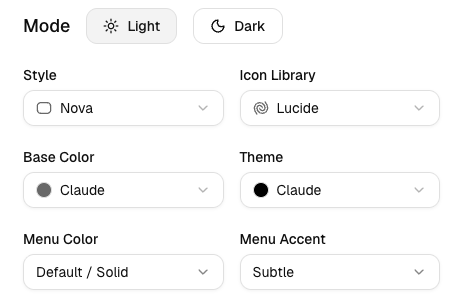
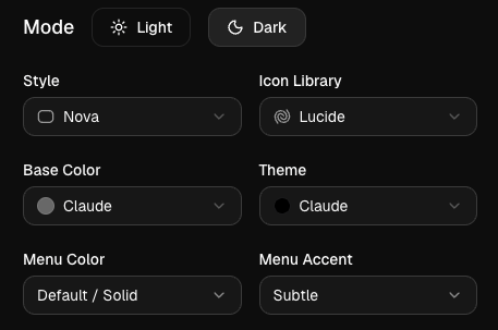
| Mode | Switches between Light and Dark color scheme. Updates the page appearance immediately. |
| Style | UI style variant - Nova, Vega, Maia, Lyra, Mira, Luma, Sera, Rhea. Shapes the overall look and feel of components. Note: Lyra and Sera lock the radius setting. |
| Icon Library | Icon set used across all components - Lucide, Tabler, Hugeicons, Phosphor, Remixicon. |
| Base Color | Neutral foundation of the theme (Zinc, Stone, Neutral, Slate, Gray) - affects backgrounds, borders, and muted tones. |
| Theme Color | Primary accent color layered on top of the base (e.g. Blue, Red, Violet, Green, Orange). Mix any base + theme combination freely. |
| Menu Color | Controls the sidebar and dropdown menu appearance - Default, Inverted, Translucent. |
| Menu Accent | Accent style for active/hover states inside menus - Subtle (muted highlight) or Bold (primary color highlight). |
Presets
The Presets section lets you quickly apply a complete pre-built theme or manage your saved custom themes.
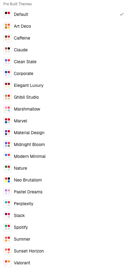
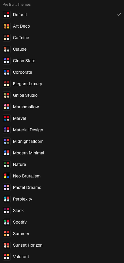
- Preset dropdown: Choose from a curated list of built-in themes. Selecting one instantly applies all colors, fonts, radius, and style settings.
- Your saved themes: Any themes you've saved appear in the dropdown alongside the built-in presets, so you can quickly switch between them.
- Import: Paste raw CSS variables from any shadcn/ui theme to import it directly into the Theme Generator.
- Random: Picks a random preset and applies it - a quick way to explore different looks.
- Contrast Checker: Validates your current theme's color combinations against WCAG accessibility guidelines.
Saving Your Theme
Press and hold the Hold to save theme button to save your current theme. The button fills as you hold it - release once it completes.
- Free users: Themes are saved to your browser's localStorage. They persist across page reloads but are tied to the current browser and device.
- Pro users: Themes are saved to your account database and synced across all your devices.
Colors Tab
The Colors tab gives you full control over every individual color variables in your theme, organized into groups.
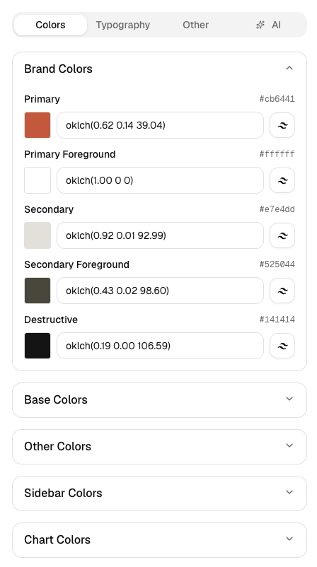
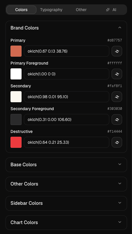
- Brand Colors: Primary, Primary Foreground, Secondary, Secondary Foreground, Destructive - the core action and brand colors used across buttons, links, and alerts.
- Base Colors: Background, Foreground, Card, Popover, and their foreground variants - the neutral canvas of the UI.
- UI Colors: Muted, Accent, Border, Input, Ring - used for subtle backgrounds, focus rings, and dividers.
- Sidebar Colors: All sidebar-specific tokens for navigation and menu theming.
- Chart Colors: Five chart color tokens for data visualization components.
Click any color swatch to open the color picker. You can pick a color visually, enter a hex value, or type an oklch value directly in the input field. You can also browse and apply Tailwind CSS colors directly from the picker - the full Tailwind palette is available as a quick-select color grid so you can stay consistent with your Tailwind design system.
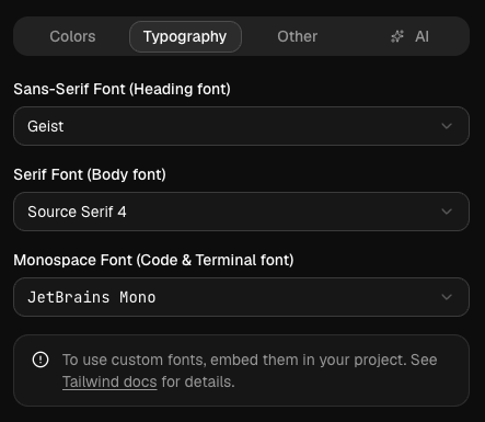
Typography Tab
The Typography tab lets you customize the three font families used across your theme.
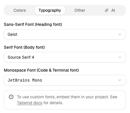
- Sans-Serif: The default UI font - used for labels, headings, buttons, navigation, and all general interface text. Best choice for dashboards, admin panels, landing pages, and SaaS apps.
- Serif: Used for long-form body copy and editorial content where readability matters. Great for blogs, documentation, marketing pages, and news sites.
- Monospace: Used for code blocks, terminal output, inline code, and all technical content. Ideal for developer tools, code editors, API docs, and CLI references.
Other Tab
The Other tab covers border radius and shadow controls. All values update live in the preview.
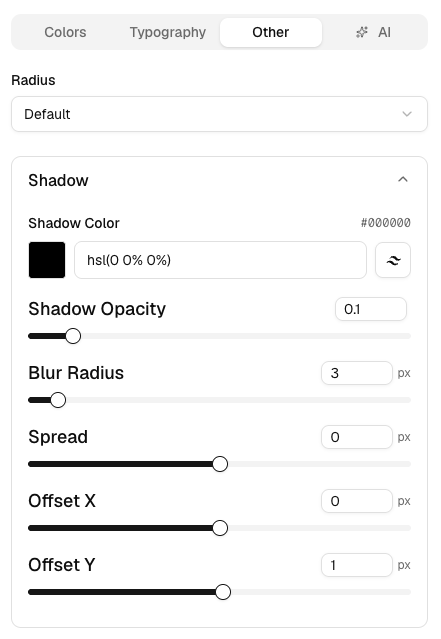
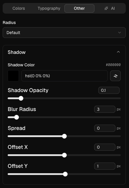
- Radius: None, Small, Medium, Large, or Default. Locked when using the Lyra or Sera style.
- Shadow: Fine-tune the shadow used across components - color, opacity, blur, spread, horizontal and vertical offset.
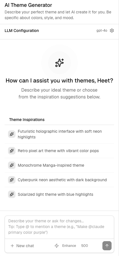
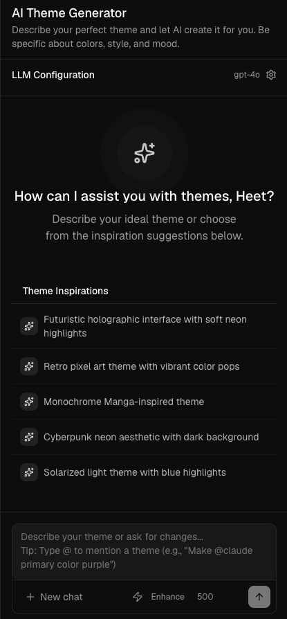
AI Tab
The AI tab lets you describe a theme in plain text and have an LLM generate it for you. Configure your preferred model and API key, then type a prompt.
Supported AI Models and Setup
Powerful and versatile theme generation with excellent understanding of design principles.
Latest OpenAI model with enhanced capabilities and improved reasoning for complex theme requirements.
Great balance of speed and quality for theme generation. Our recommendation for most users starting with Claude.
Latest Claude Sonnet with improved design understanding. Top recommendation for beautiful, well-balanced themes.
Most powerful Claude model for complex, high-quality theme generation with exceptional attention to detail.
Fast and efficient theme generation from Google with excellent balance of speed and quality.
Completely free to use. Great for experimenting and learning without any API costs.
API Key Setup Instructions
OpenAI (GPT-4o & GPT-5.2)
- Visit OpenAI API Keys
- Sign in to your OpenAI account or create one
- Click "Create new secret key"
- Copy the key and paste it in the Theme Generator AI settings
- The same API key works for both GPT-4o and GPT-5.2
Anthropic (Claude Sonnet 4.5, Claude Sonnet 4.6 & Claude Opus 4.6)
- Visit Anthropic Console
- Sign in or create an Anthropic account
- Generate a new API key
- Copy and add it to your AI settings - works for all Claude models
Google (Gemini 2.5 Flash)
- Visit Google AI Studio
- Sign in with your Google account
- Click "Create API key" and copy it to your AI settings
Groq (Llama 3.3 70B) - Free
- Visit Groq Console
- Create a free Groq account and generate an API key
- Add it to start using Llama 3.3 70B for free
AI Features
Enhanced Prompt Feature
Use the prompt enhancement button to automatically expand and improve your theme description before sending. This rewrites your prompt with more design-specific detail, leading to better and more consistent results.
@ Theme References
Type @ in the prompt textarea to reference an existing theme as a starting point:
- Built-in themes: Pick from the curated preset collection
- Your saved themes: Reference any theme you've previously saved
- Current theme: Modify or iterate on your currently active theme
Chat Checkpoints
As the AI generates themes, checkpoints are created at each step. You can go back to any checkpoint, re-apply a previous version, or save a generated theme directly to your account from the checkpoint panel.
Copying Your Theme
Click the Copy button at the top of the Theme Generator panel to open the theme export dialog. Before copying, select either Radix UI or Base UI as your component base - this determines which registry the CSS variables target.
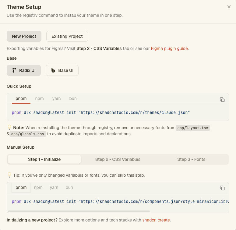
There are two ways to add your theme to your project:
Option 1 - Install via Registry (Recommended)Pro
If you have saved your custom theme and want to install it in one command, use the registry CLI from the copy dialog. This is the fastest approach - the theme CSS, components.json configuration, and font setup are all applied to your project automatically with no manual steps.
Later, if you update the theme again (e.g. tweak colors or style), simply re-run the same registry command to pull in the latest version.
When reinstalling a theme through the registry, remove any unnecessary font imports from app/layout.tsx and font declarations from app/globals.css to avoid duplicate imports and conflicting CSS declarations.
Option 2 - Manual Setup
If you prefer to apply changes manually or have only made minor tweaks, follow the three steps in the copy dialog. First, select whether you are setting up a New Project or an Existing Project - this controls whether Step 1 usesinit orapply:
- Step 1 - Initialize / Apply:
- New Project: Run
shadcn initto initialize your project with the correct style variant, component base (Radix or Base UI), icon library, and menu settings. This writes yourcomponents.jsonand installs all components in the selected style. - Existing Project: Run
shadcn applyto apply the theme on top of your existing project will be re-install in the components based on the styles you have selected for eg. Lyra or Mira style. You can skip this step entirely if you have only changed CSS variables or fonts.
- New Project: Run
- Step 2 - CSS Variables: Copy the generated CSS block and merge it into your
app/globals.css. Do not replace the entire file - only update the:rootand.darksections to avoid overwriting your custom styles. You can also choose your preferred color format (OKLCH, HSL, RGB, or HEX) before copying. - Step 3 - Fonts: If you selected custom Google Fonts, apply them to your
app/layout.tsx. Remove any old font imports, add the newnext/font/googleimport, declare the font variables, and spread them into your<html>className. Skip this step entirely if you haven't changed fonts.
To import your theme into Figma via the shadcn/studio Figma plugin, switch to the CSS Variables tab (the second tab in the copy dialog) and copy those variables and paste them into the plugin. The plugin reads the CSS variable values and applies them to your Figma styles, allowing you to keep your design files in sync with your generated themes.
Undo & Redo
Every change you make is tracked automatically - up to 30 steps per session. Use the undo and redo buttons at the top of the panel to step through your history. History persists in localStorage across page reloads within the same session.
Resetting to Default
Click the reset icon (rotate arrow) in the Theme Generator header to discard all customizations and restore the default theme. On component docs pages this also resets the component base back to Radix UI. Resetting does not delete your saved themes.
Free vs Pro Features
| Features | Free | Pro |
|---|---|---|
| Theme Customization (colors, typography, style, radius) | ||
| Live preview across all pages | ||
| Presets & Import CSS variables | ||
| Save theme | localStorage (browser only) | Database (synced across devices) |
| Custom theme registry & one-command install | ||
| Undo / Redo | ||
| Contrast / Accessibility Checker | ||
| AI theme generator | ||
| Theme Sharing | ||
| Theme Storage & sync across devices |
Every change is tracked automatically - up to 30 steps per session. Freely experiment knowing you can always step back. History persists in localStorage across page reloads within the same session.
Automatically validate your theme colors against WCAG guidelines. Get real-time feedback on contrast ratios so your theme is readable and accessible to all users.
Save unlimited custom themes to your account and access them from any device. Free users are limited to a single theme saved in browser localStorage.
Share a link to any of your saved themes with teammates or the community. Anyone with the link can preview and install your theme directly.
Your saved themes are published to a personal registry. Install any of them into your project with one CLI command - no manual copy-paste needed.
Describe a theme in plain text and let an LLM generate it for you. Supports OpenAI, Anthropic, Google Gemini, and Llama (free via Groq). Includes prompt enhancement, @ theme references, and chat checkpoints.
Best Practices
Writing Effective AI Prompts
- Be specific: describe colors, mood, brand personality, and overall style
- Mention your use case: dashboard, marketing site, blog, e-commerce, etc.
- Reference design aesthetics: minimalist, modern, glassmorphism, corporate, playful
- Use @ references to start from an existing theme and iterate on it
- Enable prompt enhancement to let the AI enrich your description automatically
- Include accessibility needs if high contrast or specific contrast ratios are required
Theme Development Tips
- Preview your theme across all component types - buttons, cards, tables, forms - before finalizing
- Use the Contrast Checker (Pro) to ensure WCAG AA compliance before shipping
- Save checkpoints during AI generation so you can return to intermediate versions
- Share your theme with teammates for feedback before publishing to your registry
- Free users: remember that localStorage themes are browser-specific - use the Copy button to back up your CSS